Touch Controls in Cars: Why “More Screen” Is Not Automatically Better
Large touchscreens are now standard, whether in an electric car or a combustion-engine vehicle. The idea is understandable: everything in one central location, flexible software updates, fewer switches and a “cleaner” look. In practice, however, a different picture repeatedly emerges: the deeper functions are buried in menus, the longer drivers take their eyes off the road.
A Swedish test conducted again after four years makes the problem quite clear: on average, touchscreen operation has not improved, but has instead become slower and more distracting.
How the Test Was Conducted and Why the Results Reflect Everyday Driving
In the test, participants had to complete typical tasks after first familiarizing themselves with each vehicle. The tasks were deliberately based on everyday use, such as activating the heated seats or similar functions that many of us actually use while driving.
Crucially, the tasks were performed at around 110 km/h. Among other things, the testers measured how long each operation took and how far the car traveled during that time. This is a good indicator of how long a driver is mentally and visually “away” from the road.
Result: Worse on Average Than Four Years Ago
In the latest test, the cars traveled an average of 813 m while the tasks were being completed. Four years ago, the figure was 756 m. The average time required also increased by around 2 seconds.
The key conclusion from the analysis is that a large, high-resolution screen cannot compensate for poor menu design. If simple functions require navigating several layers, tapping small touch targets or dealing with inconsistent logic, operation quickly becomes cumbersome while driving.
Which Cars Performed Better and Worse in the Test
A conventional vehicle with traditional controls served as the benchmark: a 2005 Volvo delivered the best result. A current Volvo XC60 also ranked near the top. A Skoda and a Tesla also came in below 700 m.
At the other end of the scale, several models recorded distances of more than 1,000 m, including the Toyota Corolla Cross, Mercedes CLA and Mazda CX-60. What stands out is that this is not about whether a car has a touchscreen, but specifically about control logic, start-up times and whether important functions can be accessed directly.
Mercedes Superscreen: Plenty of Technology, but Not Automatically Better Usability
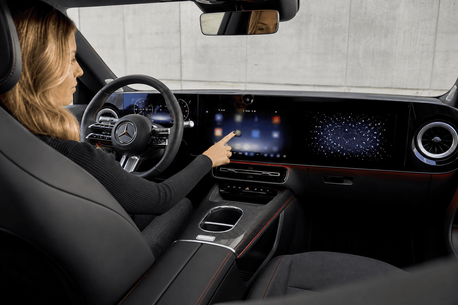
One Mercedes system with an expansive screen layout stood out in this test, with its operation rated as a step backward. The comparatively long time between unlocking the car and being able to use the touchscreen was also criticized. This is relevant in everyday use because “sluggishness” is not only noticeable while driving, but also when setting off and making quick adjustments before departure.
This is notable because Mercedes positions its current screen concept as forward-looking. That is not necessarily a contradiction, but the measurements show that a large display area alone is not enough. What matters is how quickly and clearly users can reach the function they want.
Tesla and the Rest: Software Can Help, but It Cannot Replace Good Structure
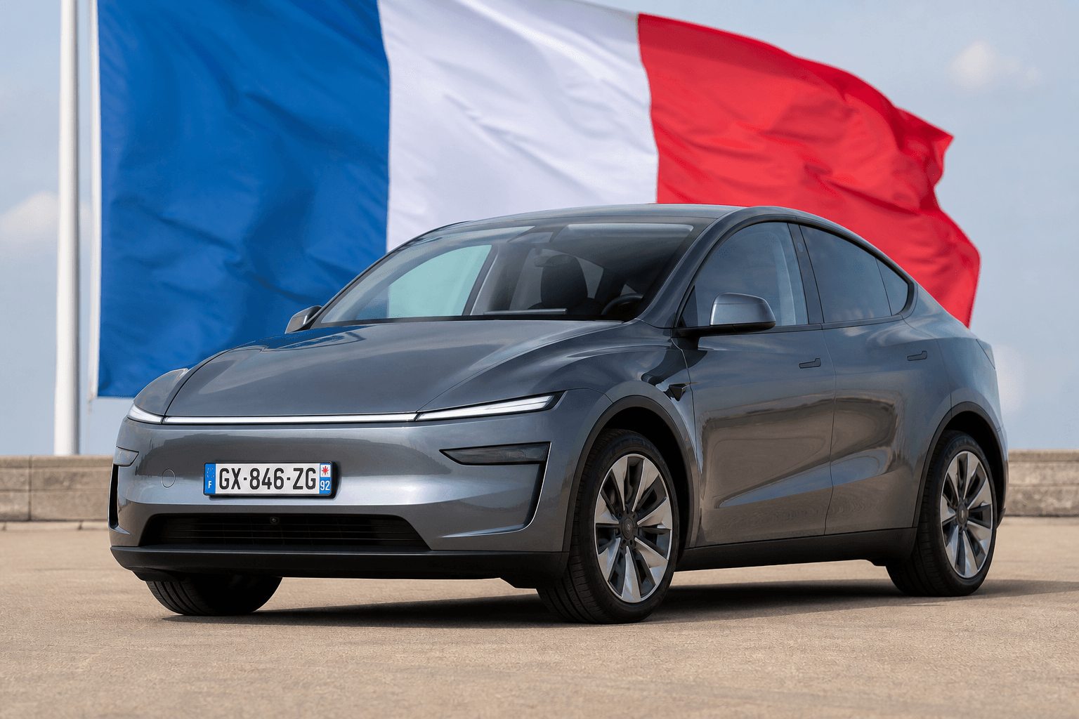
Tesla is often reflexively cited in such discussions as an example of “everything being touchscreen-only.” The context here is interesting: in the test, a Tesla came in below 700 m, a comparatively good result. This suggests that fast response times, clear layouts and optimized processes can at least mitigate the disadvantages of touch controls.
For those interested in the model behind the result, our Tesla Model Y model page provides the key specifications, while our Tesla Model 3 page also shows just how heavily Tesla relies on software and user-interface design.
Why Skoda Scores Well With “Touch Plus Buttons”
Skoda impressed in the test with a hybrid strategy: a touchscreen for navigation and complex settings, plus physical controls for frequently used functions. Many consider this combination the sweet spot because it reduces the need to look away from the road while still enabling modern features.
If a control can be located by touch alone, the process is simple: reach out, press the button, done. Touch operation often means finding the target, positioning your finger and checking that the input was registered. That is not inherently bad, but for climate control, heated seats or defrosting, it is unnecessarily cumbersome.
Real-World Impact: It Is About Attention, Not Nostalgia
The difference may sound small at first, but it matters on the road: at 110 km/h, two additional seconds per operation quickly translate into dozens of extra meters traveled while distracted. Moreover, the distance measured is only part of the issue. More important is the shift in attention: eyes off the road → find the menu → confirm the action.
This explains why an “old” control concept performs so well in the test. It is not because old cars are “better,” but because direct, unambiguous inputs for frequently used functions create less cognitive load.
What We Really Need: Better Shortcuts, Clear Menus and Powerful Voice Control
From a technical perspective, the solution is not necessarily to “go back to 50 buttons,” but to develop smarter control concepts. These include clear shortcuts, consistent menus, larger touch targets for driving-related functions and, ideally, voice control that works without delays or misunderstandings.
Especially in electric cars, where many features are software-driven, this can be a real advantage if manufacturers treat the user interface like a product: measure, improve and simplify it. A look at architectural topics such as 800 volts vs. 400 volts also shows how fast modern platforms can be in principle, even though that is a different field. Ultimately, what matters is that technology saves time in everyday life rather than costing it.